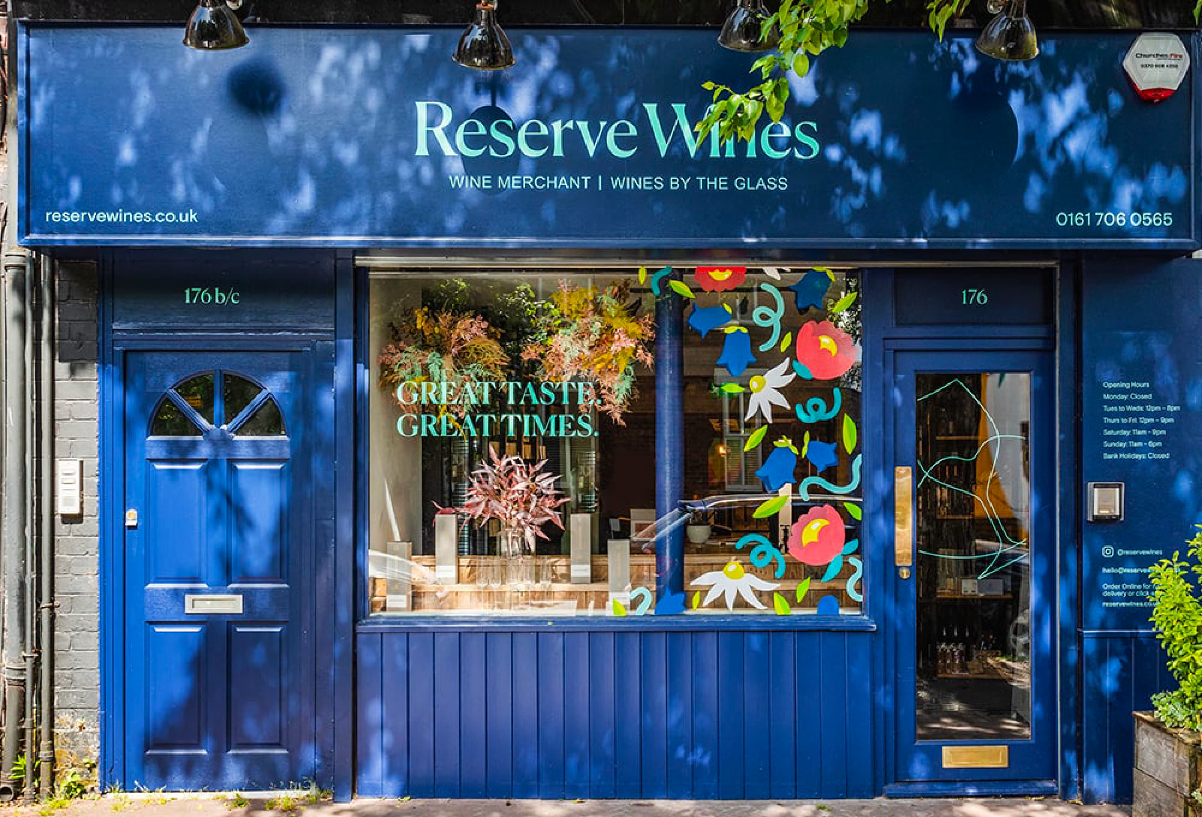
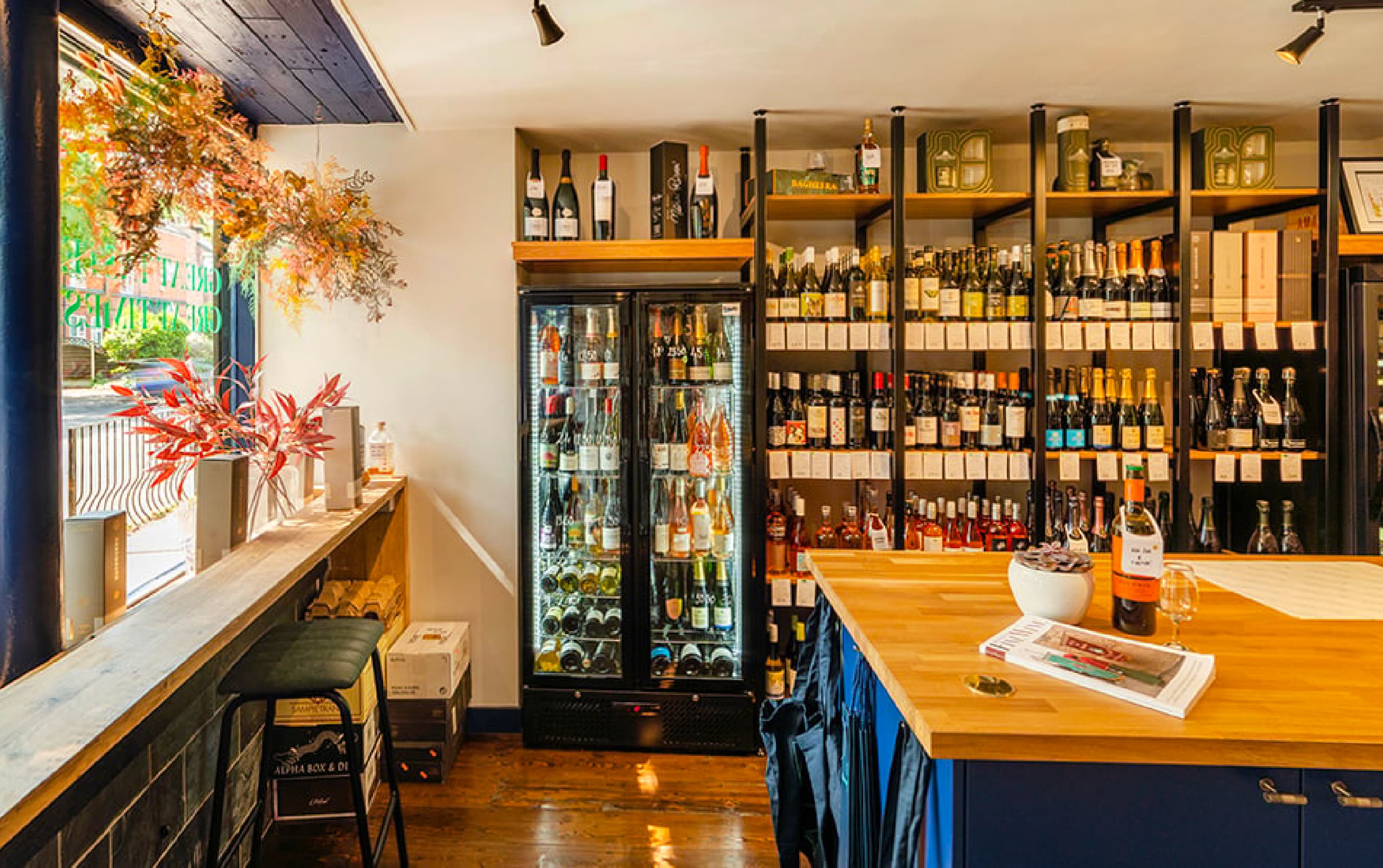
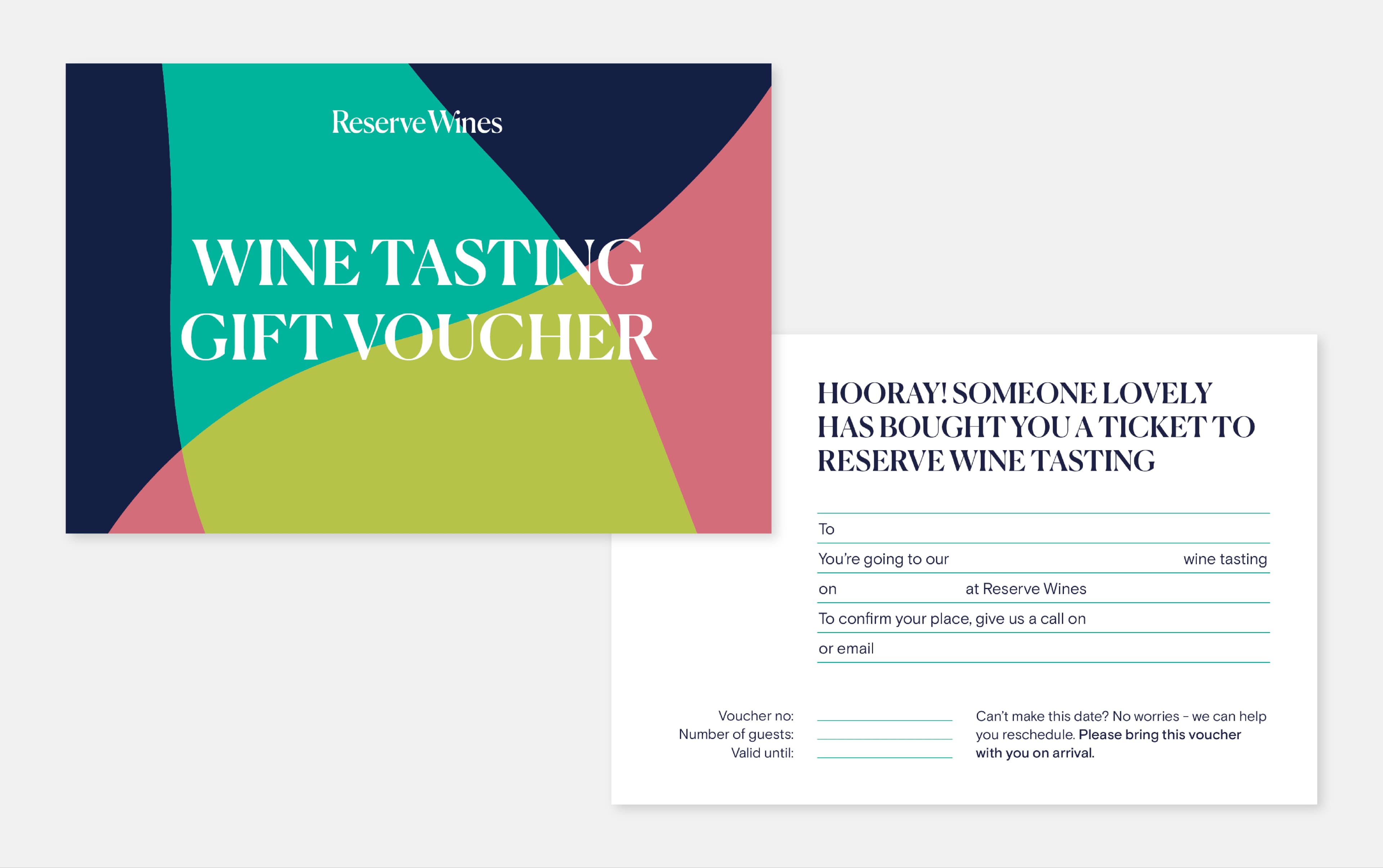
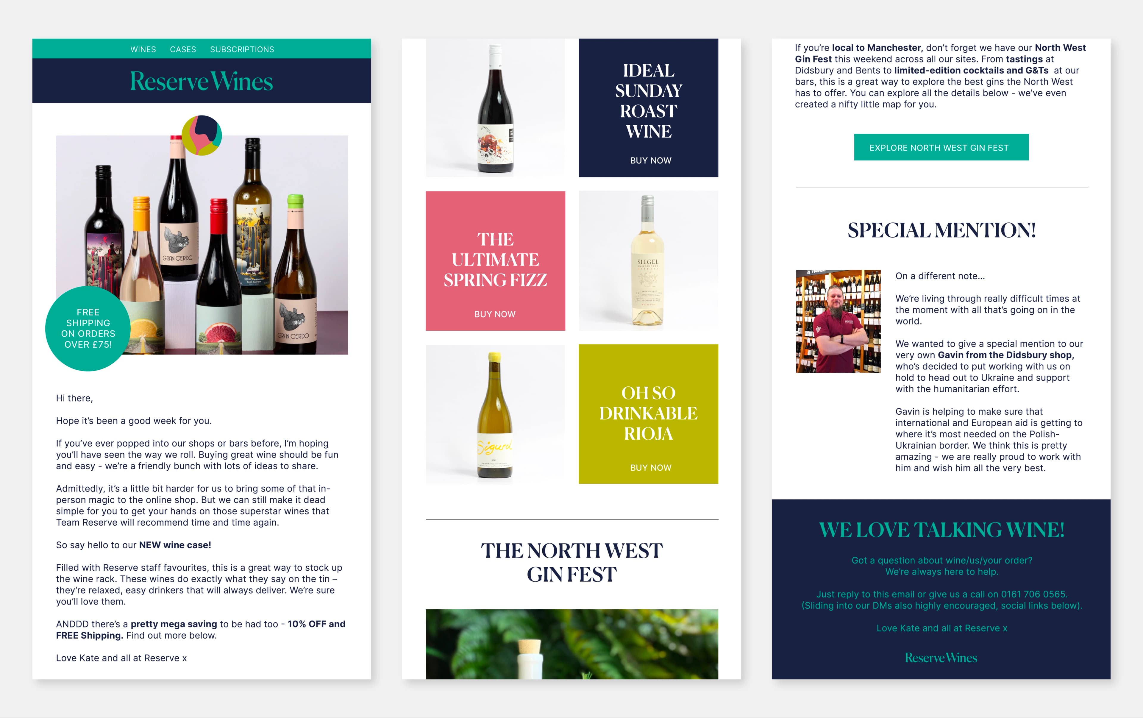
Inspiring a new generation of wine connoisseurs.
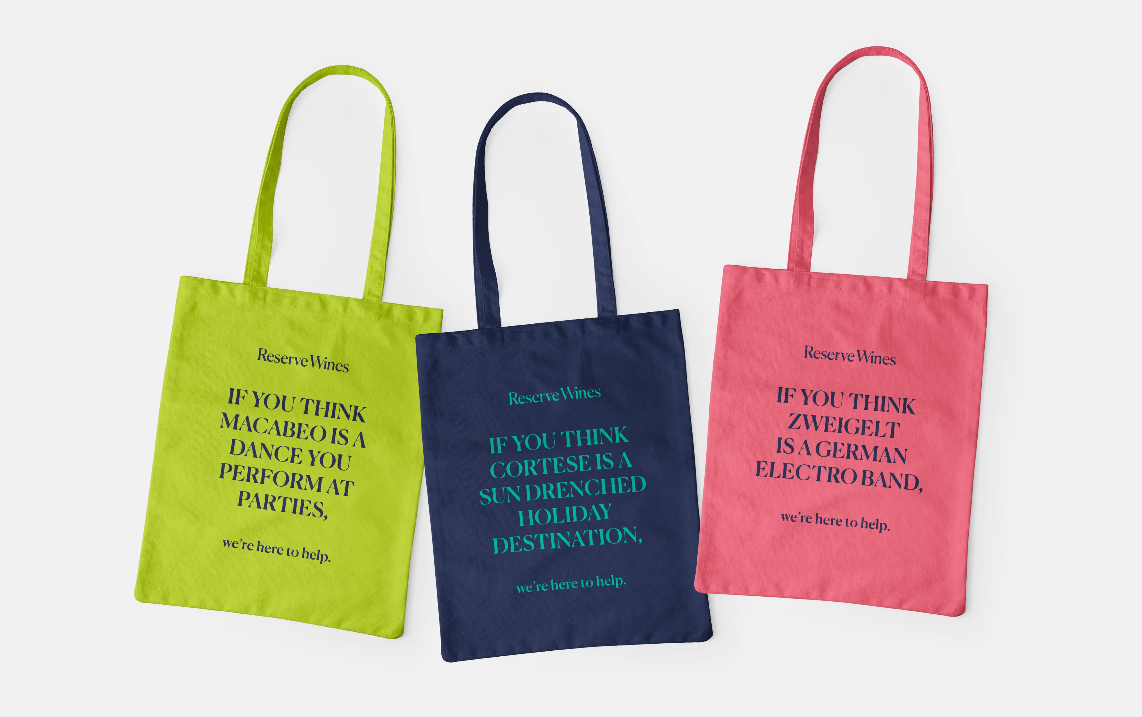
Reserve Wines
Lead Designer

Context
Background
Reserve Wines are an award-winning, independent wine merchant with the philosophy that great wine should be accessible to everyone. First opening in 2003 in West Didsbury, they have used their wine expertise to build a loyal customer base across the North West. But it wasn’t always like this. In fact, Reserve Wines was born when owner Kate visited a wine shop and was made to feel uncomfortable for her (then) lack of knowledge surrounding wine.
Challenge
To appeal to a larger audience by making the brand more memorable and fun, in an effort to inspire the next generation of wine drinkers and better reflect Reserve Wines values. Happy with their existing name and ethos, we (the team at Glorious Creative) set out to provide Reserve Wines with a well-needed brand identity refresh that encapsulated the empowerment and adventure of their wonderful world of wine.


Design Process
Redefining Reserve Wines
To kick things off, a series of brand workshops allowed us to delve deeper into the brand and first re-define the Reserve Wines brand platform, condensing the essence of the company into three simple statements.
The Purpose
To amaze and delight our customers with quality wines, delivered by a passionate and expert team.
The Vision
To become the nation’s favourite independent wine company, by engaging, inspiring and being imaginative in our approach.
The Mission
To raise the expectations of all wine drinkers through our unrivalled service and knowledge, becoming trusted companions to our customers as they explore wine.

Brand Personas
We developed and brought to life three brand personas that would help us to better understand the customers’ values, beliefs, attitudes and behaviours, underpinning any future creative development.


Colour & Illustrations
Colour plays an essential role in any visual identity toolkit. So, to ensure adequate flexibility, I devised a primary colour palette for Reserve Wines. These bright and bold colours set a positive and optimistic visual tone for the brand. They were incorporated across all assets, including the suite of brand illustrations I created, designed to promote the concept of bringing wine and people together.


Typography & Tone of Voice
To ensure consistency throughout the clients’ communications and content, we adopted a typographic style that will be distinct and increase visual recognition. The visual appearance is light and airy. We also created a tone of voice that focuses on what Reserve Wines can deliver for their customers, keeping it interesting, authentic and engaging. The use of first-person helps to create a more approachable and relatable tone of voice for potential customers allowing them to feel like they’re in direct conversation with the brand.


Outcome
The outcome was a fun, memorable visual identity that instils longevity in the Reserve Wine brand, preparing them for future growth ventures and better reflecting the company values, to allow them to inspire the current and next generation of laid back wine drinkers.