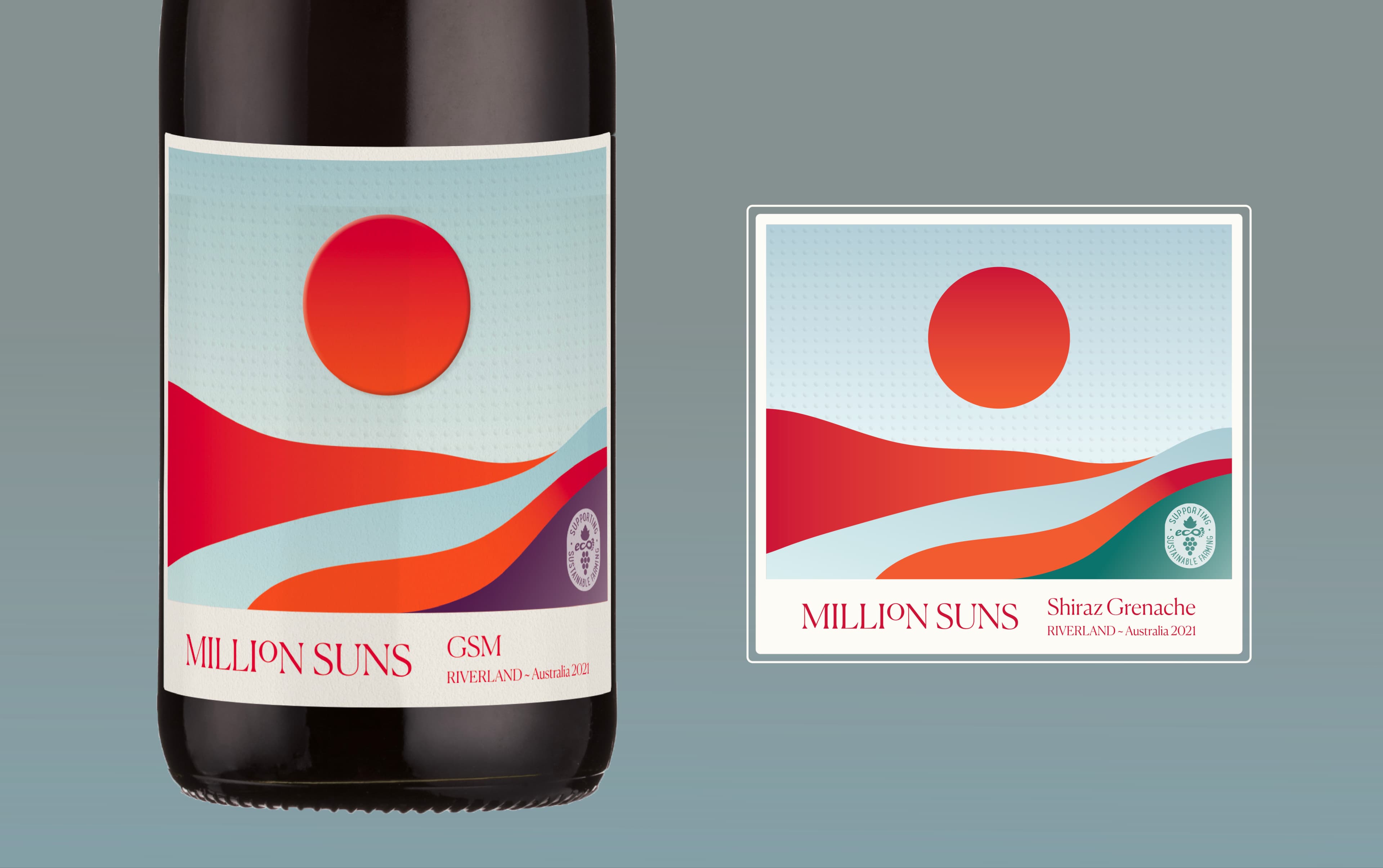
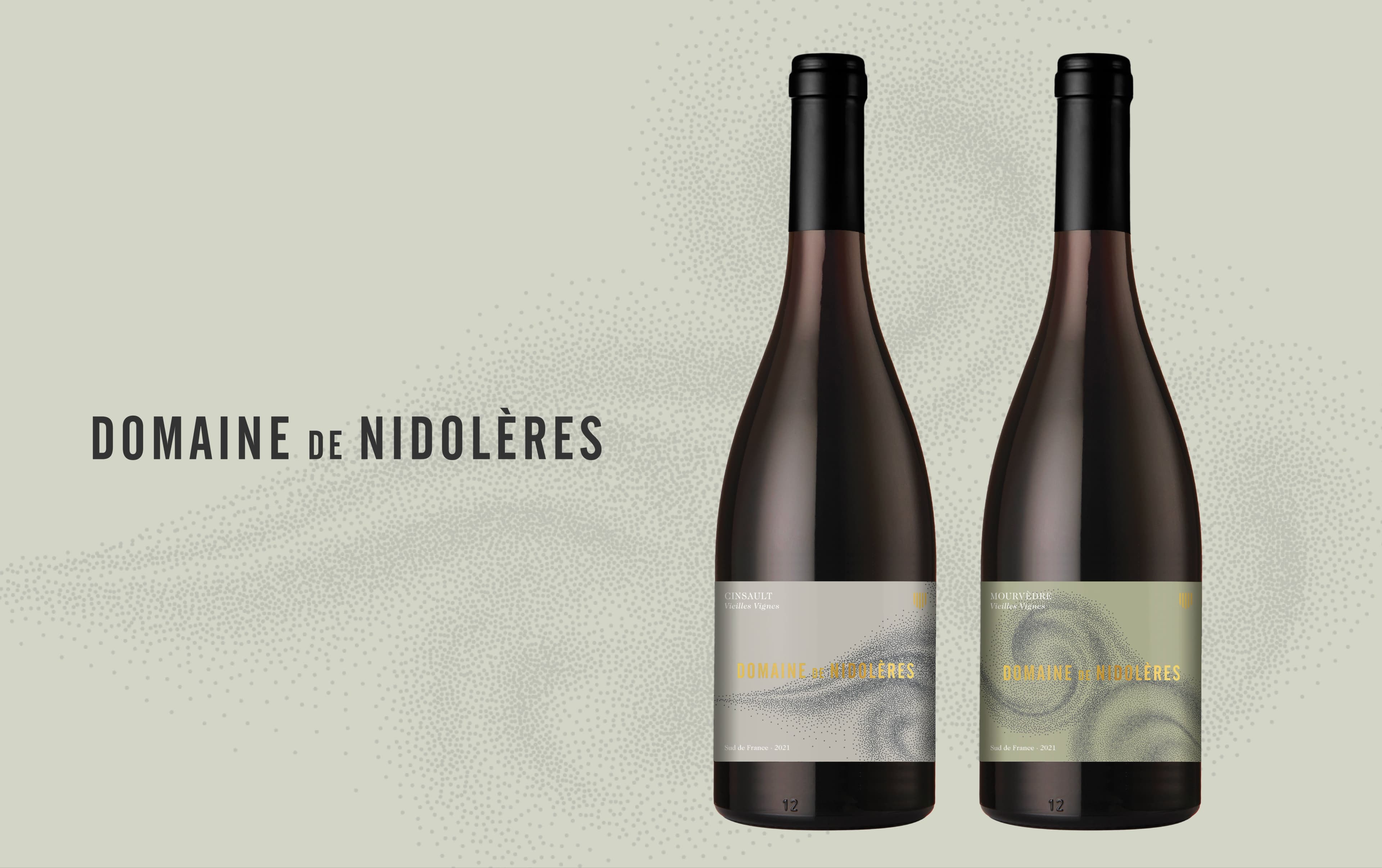
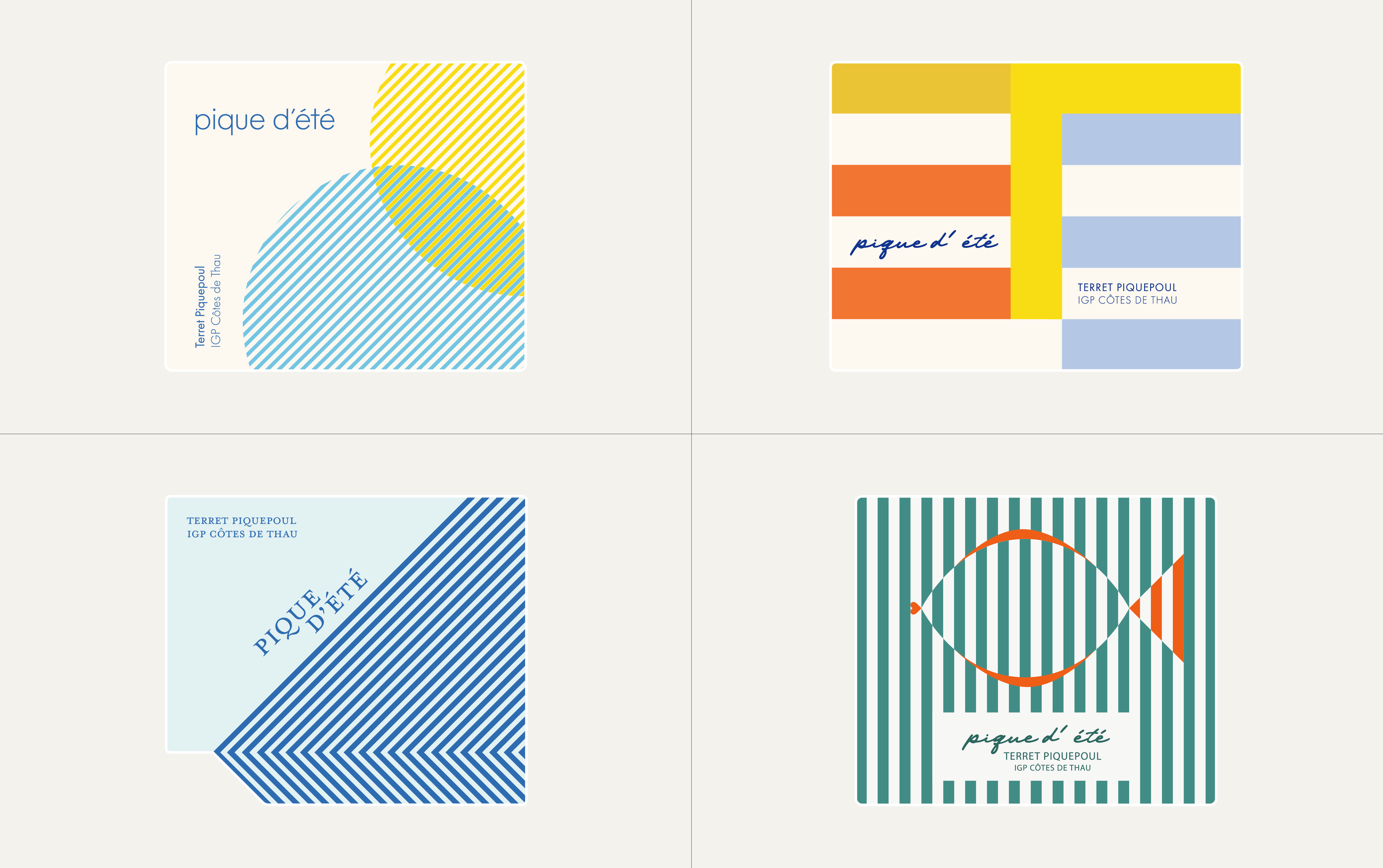
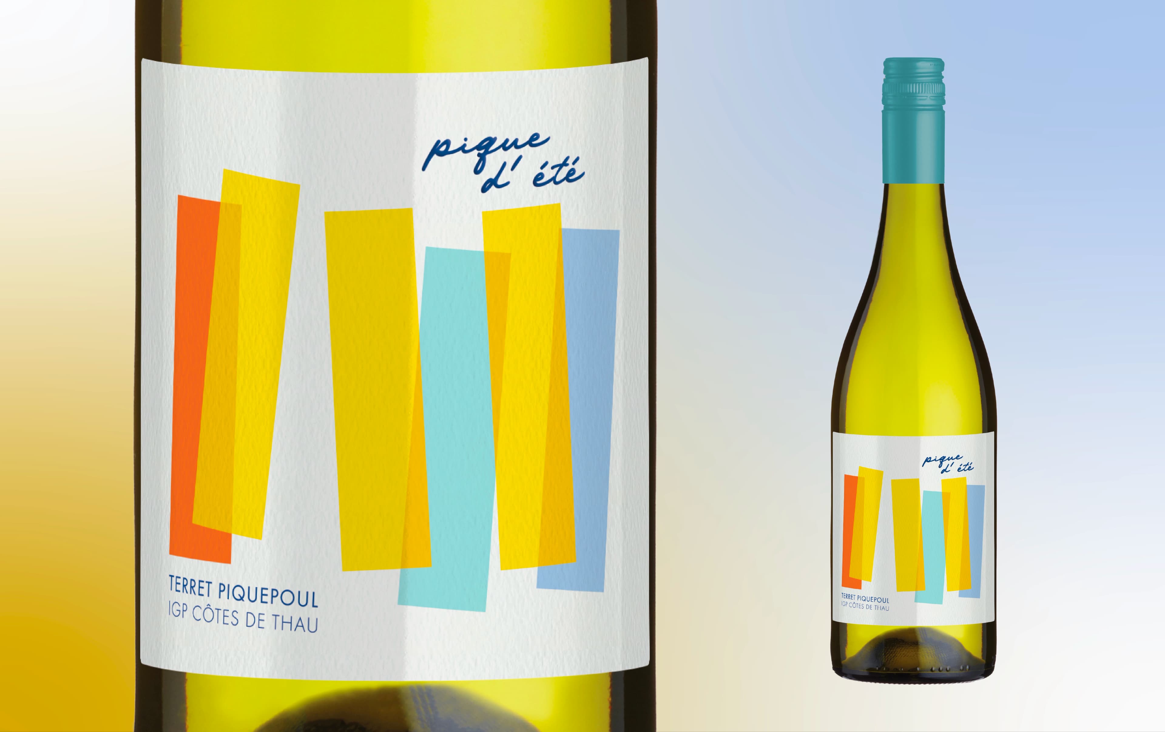
How do you bring a bottle of wine’s story to life in a space that’s 95mm x 105mm?
Sense of Place
Graphic Designer

Context
Background
Sense of Place is described as ‘the wine creatives’ for good reason. They’re in from the very beginning. Visiting vineyards, talking to the producers, understanding the trade customers and consumers, creating the brand names, the stories and providing the creative direction. I was delighted to collaborate with Lee Middleton, MD and Creative Director, on creating highly distinctive and effective wine label designs.
Challenge
To bring a distinctive quality and personality that demands interest, attention and preference. Once on the shelf or in the restaurant, the label has to do the ultimate selling job and reflect the quality in the bottle.


Wine Labels
Domaine de Nidolères
The Domaine de Nidolères is a family vineyard situated in Tresserre, South of France. Writer Adrienne Cazeilles describes the area as ‘a harsh and dry land, burning hot under the summer sun, sculpted by the relentless gusts of the Tramontana’ wind. I used Cazeilles description of the area as inspiration to draw visual cues for the wine labels. Taking inspiration from the sweeping Tramontana wind of the region, this label deliberately uses earthy colours and a simple illustration style to convey a sense of modernity.


Million Suns
Sourced from one vineyard, close to Moorook in South Australia’s Riverland. The abstract imagery is inspired by the Red Banded Cliffs on the banks of the Murray River.


Pique d’été
Pique d’été, translating from French to ‘summer picnic,’ encapsulates a wine that is fresh, fruity, with delightful citrus notes. The label is crafted to reflect these characteristics, with the use of colour and lively notes.